- Home
- The Element of Color in Art
- Complementary Colors in Art
- Painting with Complementary Colors
Painting with Complementary Colors - Ideas and Inspiration
Painting with complementary colors is a lot of fun! Adding a touch of a complementary color to your work can transform a dull, monotonous color scheme into something stunning!
Just think of Van Gogh - didn't he just love those yellow/mauve; blue/orange combos!
Want to try it too? If you've been in a bit of a rut lately, one way out is to see what other artists are doing - it can spark off some fresh ideas of your own.
So get inspiration from the contemporary artists below - they deliberately use complementary colors in their paintings and they know what they're doing!
But first, if you need a reminder, let's find those special colors on the color wheel...
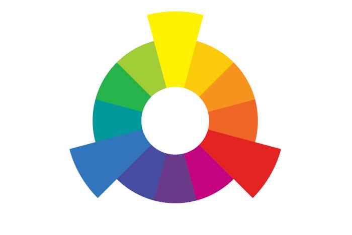 Color Wheel showing primary colors and their complementary colors.
See the large wedges on the wheel - yellow, red and blue? These are the primary colors (which we can't make by mixing any other colors together).
Now look at the colors opposite them on the wheel - those are their complementary colors.
So yellow's complementary color is violet; red's complementary color is green; and blue's complementary color is orange.
But hold on, say you don't want to use the primaries in your painting, what then? Well, the same thing applies to any color on the wheel.
Example? You've decided to paint with that delicious lime green to the left of the primary yellow. What is its complementary? Yes, you've got it - it's that red-ish violet to the right of violet, directly opposite to your lime green.
Nothing to it really, is there? (Useful thing, the color wheel!)
Now let's move on to some contemporary artists and see what they're getting up to...
Painting with Complementary Colors - Yellow/Violet
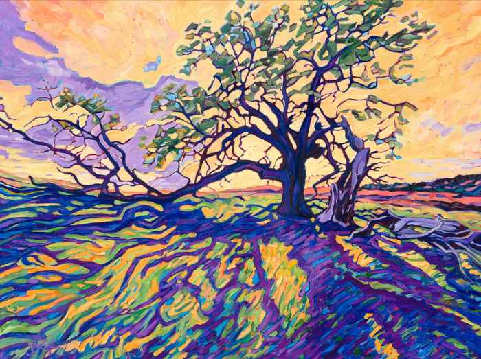 ©"Grandmother Oak" oil on canvas 30x40in, Lauren Forcella
Oh my! Did I say something about adding a little touch of a complementary?
Lauren Forcella isn't messing about with little touches, she's dived right in and come up with this joyful, shout-out-loud, yellow/violet celebration!
Maybe in reality she saw a touch of violet in those shadows? So why hold back? Van Gogh never did! She paints them as violet as possible to contrast with those yellows - each one making the other look brighter.
If this painting inspires you to have a go yourself, then do what Lauren does - look for the colors in your subject and exaggerate, exaggerate!
But is realism your passion? Next up - a still-life by Robert McPartland...
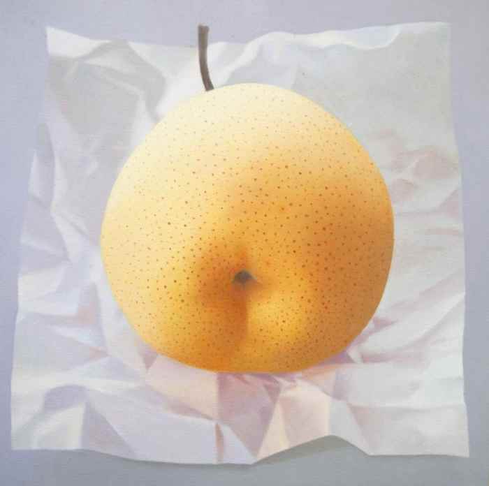 ©"Field 5: Chinese Pear on Paper" Oil on canvas, Robert McPartland
In the painting above we're seeing again the yellow/violet combination. But this time it really is 'just a touch' of color mixed with white paint which makes the pale violet tint.
It's that palest violet that really brings out the yellow of the pear. This is no accident - I think I mentioned that these artists know what they're doing!
No stronger violet is necessary to make this whole, beautifully observed painting sing like a blackbird!
Robert says,
'In a world with A.I., I believe that paint and the human spirit can make the ordinary extraordinary in a meaningful way... I strive to create visual meditations that are layered, poetic and stop time...'
If you'd like to try a still-life, there's no need to get complicated. Look what Robert has done with one pear and an interesting background!
One object, a background, and complementary colours is all you need. You can go subtle as in the above work or shout those complementaries out loud - your choice!
Next, let's look at the blue/orange duo in action and another kind of background...
Painting with Complementary Colors - Blue/Orange
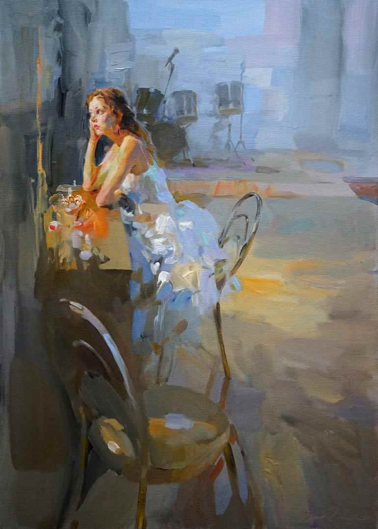 ©"In Front of the Mirror" Oil on canvas, Igor Zhuk
Sometimes backgrounds can give us a bit of a challenge. How should we best deal with them? Well here Igor Zhuk shows us two very effective ways of doing it.
Firstly, he does it with complementary colors, blue and orange. We see that much of the area surrounding the figure's head and upper body is done in shades of blue or blue-greys. This brilliantly shows up blue's complementary color - orange. Why does he want to do that?
That bright splash of orange on the table, reflected in the young woman's head and arms, stands out strongly against the blue, immediately bringing our attention to her - the main subject of the painting. Only then do our eyes go to the drum-kit in the background.
But that's not all Igor does - notice that the background is painted very loosely with hardly any detail? This effectively contrasts and shows off the more detailed treatment of the figure.
Also, so that the blue-ish background is not divorced too much from the main subject, Igor touches in some warmer and less bright orange patches giving the whole work a sense of unity.
Clever stuff!
Next - a totally different style for the blue/orange color scheme...
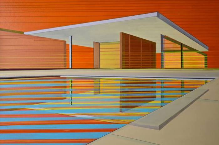 ©"Sunset Oasis" acrylic on canvas, Cecile van Hanja
The blue/orange combination again - and in this painting by Cecile van Hanja above, we see that she uses color temperature to convey the meaning of the title.
The hot orange of a sunset sky is in brilliant contrast to the blue water. Blue, being on the cold side of the color wheel is the perfect choice to portray the cool, rippling oasis below.
I love the feeling of stillness in this painting, don't you? It seems it's not only a watery oasis, but a tranquil oasis too - a place of retreat far from the noise of the outside world.
Cecile helps to portray this feeling of calm by her use of all those horizontal lines.
More on the element of line in art
Red/Green
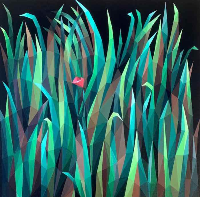 ©"Find Me" acrylic on canvas, Maria Tuzhilkina
Maria Tuzhilkina is another artist who is is deliberately painting with complementary colors. I love the humour in this geometric-style painting above, "Find Me".
A tiny red flower, thinking it's invisible amongst all the green leaves? Ha! Dream on!
This is a perfect example of how just a tiny bit of red can really stand out if you surround with all those greens and green/blues.
Next, maybe you're an impressionist fan? Below, there's a lovely one by Vahe Yeremyan...
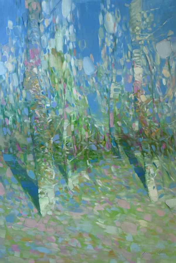 ©"Bloom Season" oil on canvas, Vahe Yeremyan
In this impressionistic oil painting Vahe Yeremyan mixes the red and green complementary colors with white to get his pinks and pale greens.
With his color choice and loose, airy brush-strokes, Vahe fills this light-filled work with a feeling of movement and the scent of Spring!
You don't have to use bright red and green if you feel they're too strong. Pink still stands out beautifully against pale green.
(Of course, if you're into water-color and you're a purist, you'll know to let the white paper shine through your color to get those pale tints.)
All Three Together?
Finally - do you like loads of color? Elizabeth Elkin certainly does! She holds nothing back in this exuberant view of a mural on the side of a city building.
We can see that she uses all three complementary color combinations - yellow/violet, blue/orange and red/green! And don't think this painting is a one off - most of her work radiates her joy of color!
So there's no need to limit yourself to one complementary duo - if you feel like using them all in the same painting, go for it!
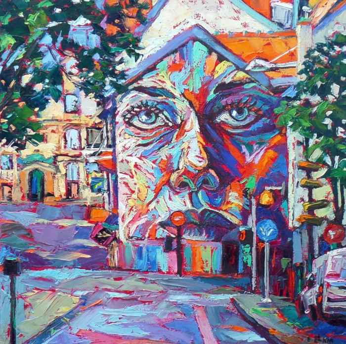 ©"The Face" oil on canvas, Elizabeth Elkin
Well, I don't know about you, but I've certainly been inspired by all the artists' work on this page.
I hope you've enjoyed them too and feel like digging out your paints and dusting off your art table!
Just have a go - it doesn't have to be brilliant right away, that's far too scary. Do what I do and creep up on it when it's not looking!
Get out any old sketchbook, pick your favourite complementary colors and splash them around a bit. Remember - at this stage, it's for your eyes only.
Once you start deliberately painting with complementary colors, you'll find a whole world opens up for you, and the ideas will start flooding in.
Good luck - as always, I'm rooting for you!
Here are the links to the artists' websites:
Lauren Forcella: https://laurenforcella.com
Robert McPartland: https://robertmcpartland.com
Igor Zhuk: https://zhuk-art.com
Cecile van Hanja: https://cecilevanhanja.nl
Maria Tuzhilkina: https://mary.tuz-art.tilda.ws
Vahe Yeremyan: https://vaheyeremyan.com
Elizabeth Elkin: https://www.trueart.ca
Like this page? Click the icons to share it.