- Home
- The Element of Color in Art
The Element of Color in Art
The element of color in art - you love it but somehow seem to have got stuck?
Yes, sometimes we do feel our work is in a rut - but in fact this is often the best thing to have happened!
It means you've moved on creatively - you've finished with what interested you in the past and can now look around for fresh ideas to kick-start a new phase in your work. Exciting!
 The Joy of Color!
It's time to bring the joy of color back into your life!
Let's see what we can come up with together to get those creative juices flowing again. There's a fascinating, colorful world out there!
 Rainbow Village, Taiwan.
Maybe you've visited the Rainbow Village yourself, but if not, and even without the added bright yellow of the dress in this photo, we can still enjoy Huang Yung-Fu's marvelous and exuberant use of color here.
He held nothing back, did he?! He obviously LOVED the element of color in art - wanted to shout it out and couldn't wait to paint it all over the walls! And his primitive style works so well with those colors too.
Want to try something like that?
Choose a motif - trees, birds, sun, flowers, animals or whatever means something personal to you, and have a go.
I'm not suggesting you tackle a whole wall right away (but if you feel like breaking out and you have a spare wall, go for it! Do a few roughs first to get your hand in.)
A smaller painting would be striking too, or even something as small as a greetings card using one or two of your motifs.
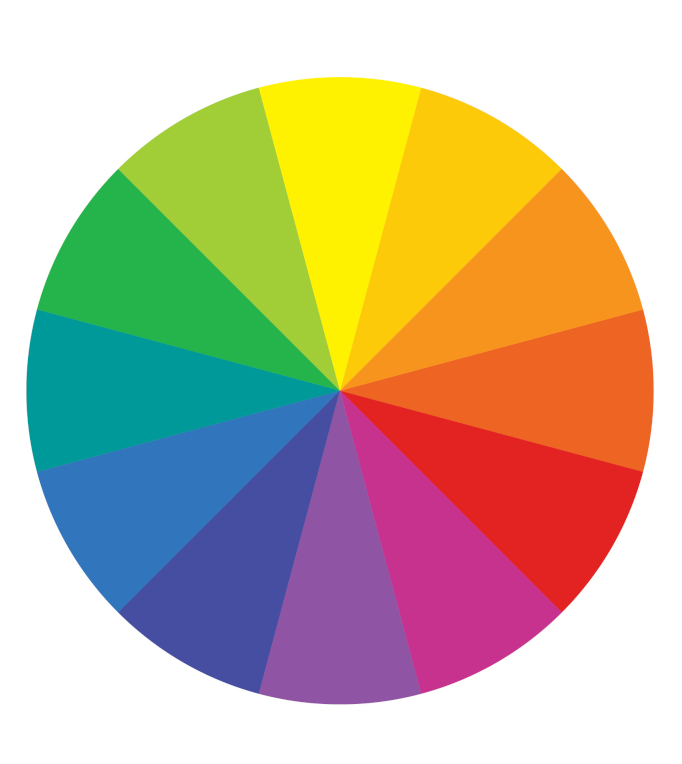 Color Wheel - a great visual aid for planning our color schemes.
Take a look at the color wheel above - it's so useful for planning color schemes or when we need to convey a certain mood in our artwork. We don't want to ruin a great idea just because we've picked the wrong color combination!
Let's think about complementary colors first. They're the ones that sit opposite each other on the color wheel - red/green, yellow/purple, blue/orange.
It's good to know these because using complementaries in the right proportions can really give your work zing!
With just a little knowledge of how to use color, you'll be amazed at how your art will be transformed.
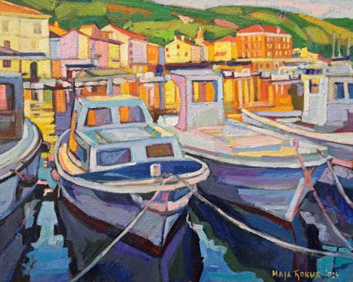 "Fishing boats, Cres" Oil on hardboard, Maja Dokic.
See how Maja has used complementary colors in this lively painting?
She immediately conveys the mood of that bright sunny day in Cres by using warm oranges and yellows where the sun hits the houses, and cool blues and purples for the boats in shadow.
The blues and purples make the oranges and yellows look brighter and sunnier. This is complementary color in action!
(I'm writing this with stormy winds and hail lashing against my studio window, so thanks, Maja, for this reminder of warm, sunny climes!)
 Colorful bell peppers.
But we don't have to go very far to find bright colors - they don't get much brighter than these bell peppers. And they're right there in your kitchen!
Yes, we've seen it all before, but now you''ll be seeing it through artist's eyes! See the red/green complementary color combo in these peppers? A close up of a couple of those would make a great still-life, especially if painted against a darker background to really make them pop.
Or just imagine bright yellow peppers on a lavender colored plate or cloth. Oh my!
What about some brilliant orange poppies against a blue sky? Or a whole field of scarlet poppies against green?
Complementary colors are exciting to work with - have a go!
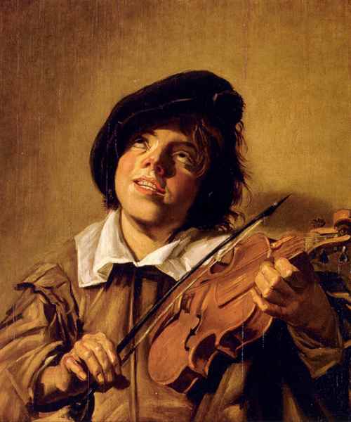 "Boy Playing on a Violin" Frans Hals (Date, between 1625 and 1635)
Now, how about analogous colors?
These are colors that sit next to each other on the color wheel. With their shared hue, analogous colors make fantastic neighbours, their subtle harmony giving us even more ways of getting the 'wow' factor in our work.
Look at this portrait by Frans Hals, painted in analogous colors. He was brilliant at capturing a fleeting moment - without even preliminary sketches, just using his amazing observational skills!
I could wax lyrical about this painting! We can see that the boy, with a smile on his face, is totally immersed in his music. He's not even bothering to look at his fingers while he's playing.
And those beautifully painted strong, flexible fingers (done with the minimum of deft brush-strokes!) shows us that the boy had obviously been playing violin for years.
Anyway, to get back to the color...
Hals has painted this work in analogous colors, mostly based around varied tones of orange and red.
Importantly, the light and dark tones throughout the work, with the addition of white (and possibly black) give life to the whole painting, and stop the color scheme from becoming monotonous.
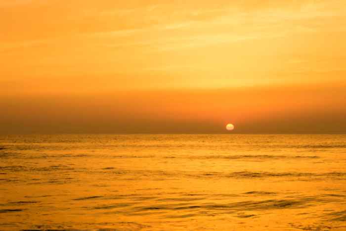 "Golden Sunrise" photo
Analogous colors are on display again in the above photo, this time giving a golden light to the scene.
Why not paint a horizontal abstract using all those fiery oranges and glowing yellows? You could even add some splashes of metallic gold paint in places?
But if you like the sea and sky format, you could paint a flock of birds flying across it in silhouette. Not black though - that would be a bit harsh. Maybe dark gold? That would look great on your wall, wouldn't it?!
If you're adding the birds, they would be eye-catching done in that metallic gold too - or even sumptuous gold leaf? Wow! Gorgeous!
Love Blues and Greens?
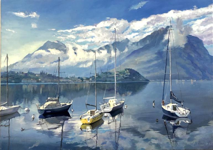 ©"Morning on the Lake" Oil on Canvas, Anastasiya Kharchenko
Of course, the element of color in art doesn't always have to be bright, does it?Sometimes we feel something quieter would suit the subject matter.
In this work the artist uses more subtle analogous colors - mostly quiet blues and blue-greens which give a feeling of tranquillity.
But hold on, what about that touch of yellow? You're right - it's not analogous to the blues, but if you cover it with your finger you'll see how important that touch of complementary color is in bringing the whole painting to life.
Anastasiya remembers her walk by Lake Como in Italy and says, "There was such silence and peace that I wanted to leave it on the canvas."
I think she achieved her purpose, don't you?!
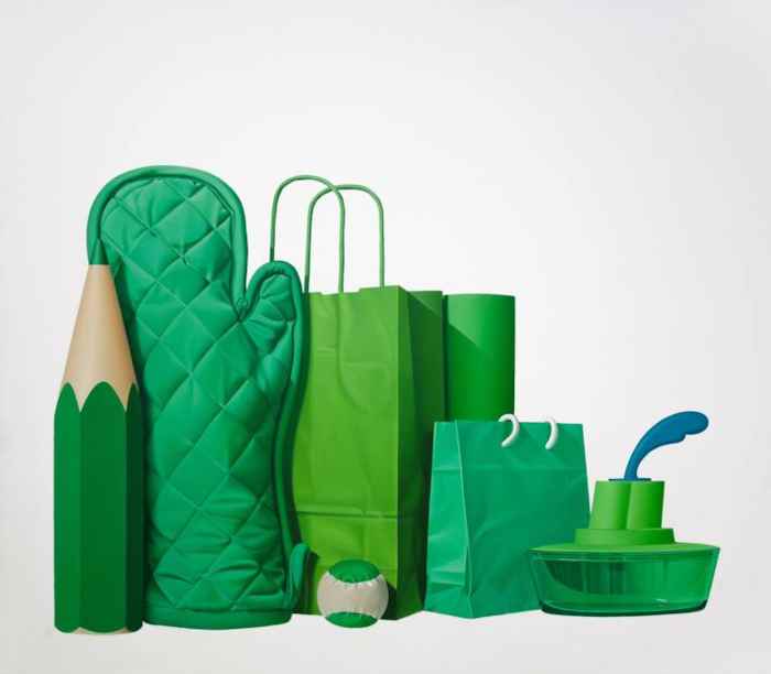 ©"Green Life" Oil on Canvas, Ildefonso Martin
Here's an artist who loves those analogous greens!
What an interesting and unusual still-life group! I love the triangular composition placed on the diagonal, too.
Ildefonso always paints from life, not photos, and says, "I try to reflect the beauty of the most humble objects."
You could set up a still life group too - picking objects only for their analogous colors.
Why don't you choose your favourite color on the color wheel; pick the two colors each side of it, then look round your house/garden/local DIY store/greengocer/toy shop/fabric shop - and anywhere else you can think of - for objects in those colors.
Arrange them together on your table or a shelf, and the whole group can't fail to be harmonious - and as an added bonus, I guarantee your still life will be unusual and eye-catching!
Blowing Hot and Cold!
 Beautiful cold colors of icebergs.
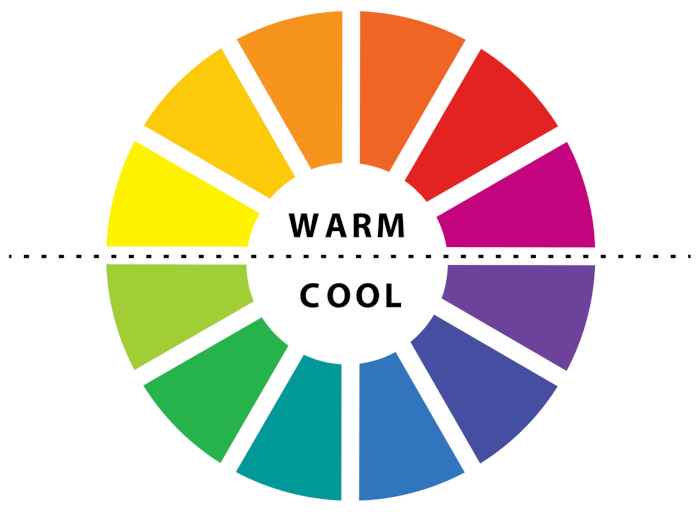
Now let's think about color temperature - those warm and cool colors.
We've seen a few hot colors on this page. Think of fire, sun, volcanoes and warm golden sand - reds, pinks, oranges and yellows are perfect for those.
Then think of cool or cold things like lakes, rivers, ocean, ice, snow, icebergs. For those subjects pick cool blues and greens - think jade, turquoise, emerald, and cerulean blue. Beautiful!
Say it with Color!
 Light-bulb Moment!
Bursting to say something and words just won't cut it? Let color say it for you!
Load your brush with the intense drama of a deep plum color or the pure exuberance of
a bright sunflower yellow.
Or take yourself and your viewer to the turquoise depths of the ocean or a cosy scarlet bonfire on a chilly evening.
Remember though, that color is personal and the impact can vary according to who is looking at it - and when they're looking at it...
Make it Personal!
 "What color would you like?"
Color can have a big effect on us as well as the viewer, so we need to factor that into any plans for new work.
Think
about Red. Red can cheer people up in the depths of Winter when they
might be feeling a tad depressed. (Holly berries, red scarves, robins.)
On the other hand, it can aggravate people in the Summer if they are already feeling stifled by the heat.
But Blue is calming at that time of year. (Floating blue fabrics, lakes, ocean.)
Green can have a settling effect too, when people are feeling anxious or flustered. (Leafy trees, soothing green decor or paintings.)
So the element of color in art is a fantastic tool to voice your inner sentiments and create your desired effect. Ah, the possibilities!
Let Loose the Magic!

Are you a perfectionist? Don't be! Try things out, experiment with
color, see it in different ways - it's all part of the journey to your finished piece,
and fun!
If we're too tightly controlled we might miss that very event that artists love - happy accidents!
Or worse, you might miss out on the very thing that catches your breath when you look at what you just did. Yes, you!
"Did
I really just put that heart-lifting dash of light pink in the area I
DEFINITELY decided would be only turquoise and emerald?
Yes, I did, and it looks AMAZING!"
See what I mean?
So, perfectionism is out at this stage. Hey, nobody else
is looking; nothing is set in stone; it's an ongoing process. Nobody is
judging you, even YOU are not judging you! You're just messing about
with some colors to see what, if anything, turns up.
Inspiration is all around us. Look closely at your surroundings;
observe the cerulean blue skies,
emerald green leaves, or the soft blush on an apple.
Love the colors of our world and never stop looking and seeing. I tell you - you'll see magical stuff others won't even notice.
So, dig out your painting shirt, load up those luscious colors and let loose the magic!
Have fun!
How to develop the Eye of an Artist
The artists Maja Dokic, Anastasiya Kharchenko and Ildefonso Martin can be found at Saatchart.com
Like this page? Click the icons to share it.