- Home
- The Element of Color in Art
- Analogous Color in Art
- Painting Analogous Colors
Painting Analogous Colors -
Ideas and Inspiration
Painting analogous colors, whatever mood you want to convey - quiet, exciting, soothing or joyful - will always give a harmonious feeling to your work. You can't go wrong with analogous colors in your tool box!
But first, as a quick reminder, let's look at the color wheel to see exactly where they sit.
Pick a color on the wheel; the colors on either side of it will be analogous to it.
Say you picked yellow - its analogous colors are the yellowish green on one side of it, and an orangey yellow on the other side.
This works for any color on the wheel. Easy, right? So take a look and pick your favourites!
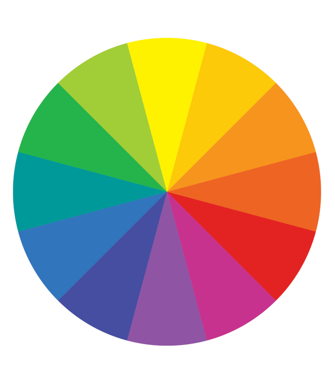 Color Wheel - pick your favourite color scheme!
Okay, so you've picked your favourite colors on the wheel. What are you going to do with them?
Feeling a bit stuck for ideas? Well, one good way to kick-start our creative juices is to see what other artists are doing.
All the contemporary artists on this page, whatever their style or medium, are using analogous colors. (I list their websites at bottom of page.)
Painting Analogous Colors Using Dominant Red
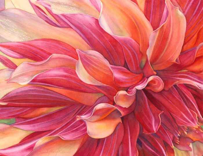 ©"Ablaze" Watercolor on paper, Sandy Haight
First, a watercolor by Sandy Haight - see how she is using red as her dominant color with orange/red and mauve/red being the analogous colors?
Sandy takes us, as she says, "up close and personal" to the flower, giving an almost abstract feel to the shapes and glowing colors of the petals.
If you love flowers, giving them a 'bee's eye' view like this is a great way to bring out their essential beauty, don't you think?
(Sometimes flowers have an annoying trick of fading before you finish the painting, so you could take a photo of it first. Nothing beats the human eye for detail but a good photo certainly helps!)
Dominant Orange
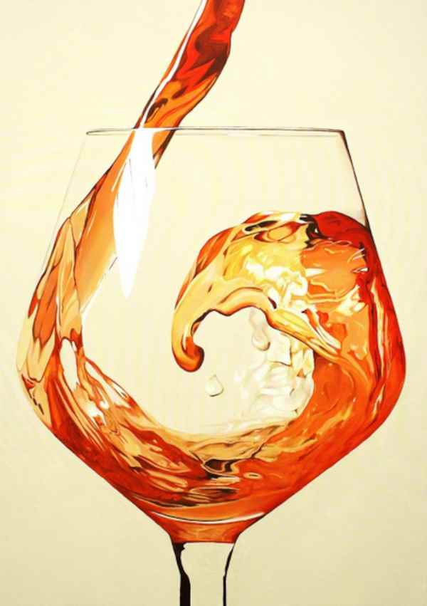 ©"Ebbrezza Degli Aromi" Oil on canvas, Lucia Bergamini
No, this is not a photo, but an oil painting by Lucia Bergamini!
A slight shift round the color wheel gives us orange as the dominant
color. Here Lucia is showing it off in her eye-catching hyperrealism
style - what a delight it is to see this intriguing, split-second movement captured in paint!
She says,
"What I do has evolved into a new kind of hyperrealism with a touch of comic strip quality that I like to call hyperrealistic pop...
I use oil on canvas and only use primary colours, which I mix to obtain all of the shades that I need. It creates deeper and more brilliant colours."
Dominant Green
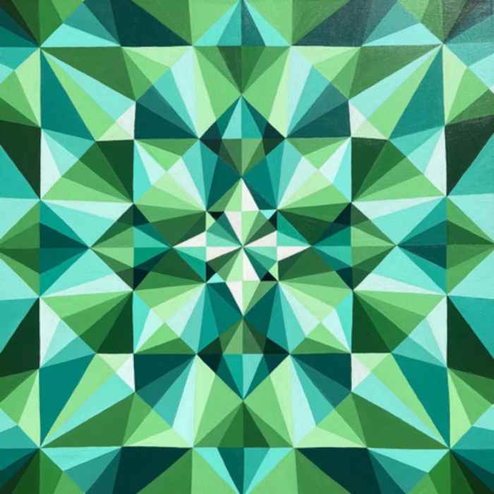 ©"Emerald" Acrylic on canvas, Maria Tuzhilkina
Here, as a complete color contrast, we have Maria Tuzhilkina's sparkling, geometric painting, 'Emerald', reminiscent of the light-catching facets of cut jewels.
There's no doubt Maria looked carefully at a faceted jewel before starting this work.
The sparkling effect? That's done by varying the use of tone - from very light, to very dark tones of green - and the geometric idea nails it!
She says,
"I love colour, lots of colour!" And in her painting she has chosen to dive into cooling analogous greens.
Speaking of diving in...
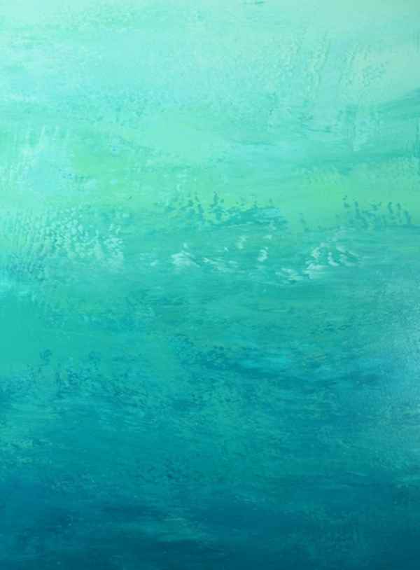 ©"Shore line" Acrylic on canvas, Suzanne Vaughan
Speaking of diving in, here's a totally different way of painting analogous colors using those beautiful greens!
I'm writing this on the hottest day of the year, and just to look at Suzanne Vaughan's large abstract 'Shore line' makes me feel cooler! How does she do it?
Of course, the color choice is vital, but how she puts the paint on is key to creating the feeling of moving water.
Suzanne says,
"Layers of acrylic paint are applied to the canvas in free gestural marks with palette knives and other tools to create a dynamic textured surface."
If you haven't tried using a palette knife before, why not give it a go? It could open up all sorts of ideas for you, not just for water, but landscapes, skies, cityscapes, even large, loose still lifes.
Try it - a whole world of luscious analogous color awaits you!
Dominant Blue
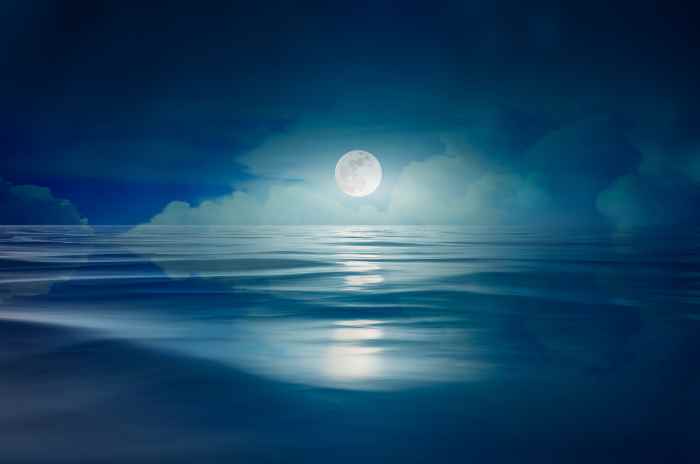 Photo of a full moon over the sea at night.
Photographs can often be a source of inspiration for us and are sometimes useful as a jumping off point for our work.
The photo above could inspire you to paint a soothing scene in blue and its analogous colors. I'm not suggesting you copy it, but rather how you could make that scene your own.
The two paintings below show different ways of dealing with a similar subject...
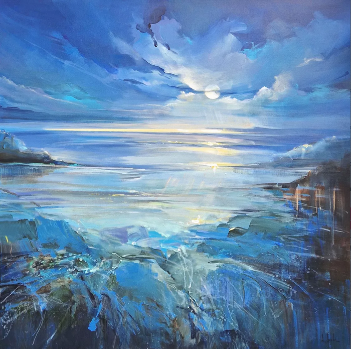 ©"The Full Moon" Acrylic on canvas, Irina Laube
Here's another artist that uses a palette knife as well as brushes - Irina Laube. This beautiful, loosely-painted abstract shows blue as the dominant color with touches of green/blue and mauve/blue in varying tones as the analogous colors.
(Did you spot that the painting is not entirely done with analogous colors? There are a few strokes of yellow, the complementary color to mauve.)
Irina says,
"... There are so many possibilities to express one's feelings or moods. Every day is like a plaything of the senses, inspirations wherever you look."
The painting is 100x100cm, about 3x3 feet - a good size to suit this expansive subject.
Do you usually paint smaller works but are feeling in a rut? You could try something bigger than you would normally handle on your table-top. It changes your perspective on your work, jolts you into thinking outside the box - and color on a larger scale has a big impact in a room.
Try it and see what you come up with - it may turn out to be a surprising new development for you.
How to use Complementary Colors
How to Develop your Artist's Eye
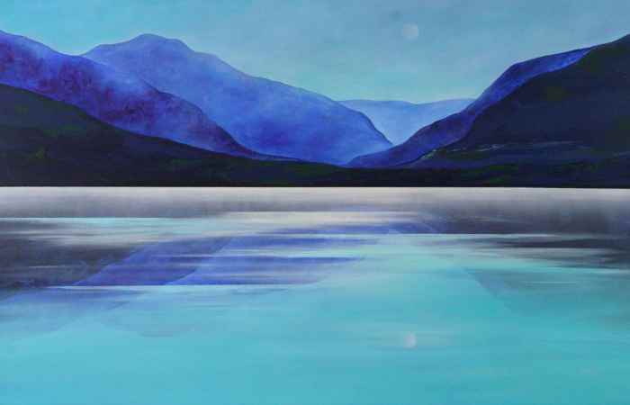 ©"Moonlight on Lake Millstadt" Acrylic on canvas, Vera Hoi
If you want to try a similar subject but with a simpler treatment, this painting by Vera Hoi could tick the boxes for you.
Vera uses the same analogous color scheme but creates the serene effect of moonlight on water with horizontal lines and uncomplicated shapes.
She says,
"...nature acts like a universal language - it helps us to reflect on the essentials and find inner stability."
Dominant Yellow
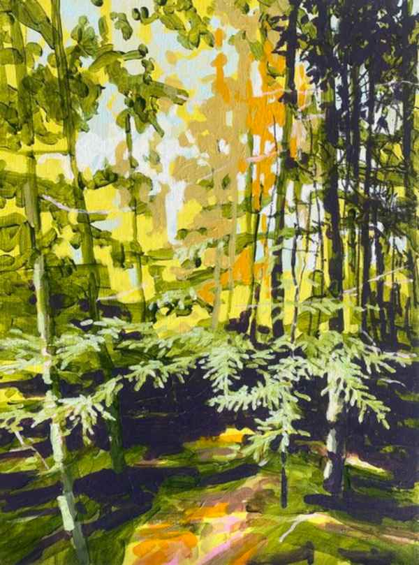 ©"Yellow Pine Forest" Acrylic on canvas, Randall Mattheis
In this painting, yellow is the dominant analogous colour, and without unnecessary detail Randall Mattheis brings to life the scent and atmosphere of a light-filled, leafy forest.
He works with economic, direct brushstrokes and much tonal variation of colour to create the effect he wants.
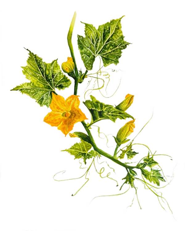 ©"Squash Flowers" Watercolour on paper, Viktoriia Kovalenko
More yellows and greens, but here the beauty does lie in the detail of this finely observed botanical illustration from Viktoriia Kovalenko.
Looking at those details we feel the pace of life slowing down a little as we share with Viktoriia her love of the plant's life and beauty.
She says,
"My goal is to convey not only the outward appearance of nature but also its depth, the emotional resonance it evokes. Through my works, I want to convey the vulnerability of the surrounding world and the importance of preserving it for future generations."
Fancy a Mandarin Anyone?!
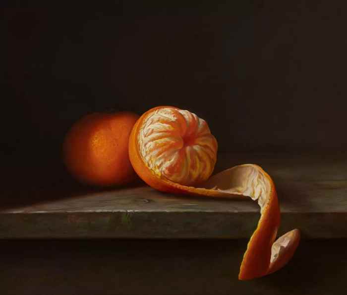 ©"The Mandarin's Secret" Oil on board, Albert Kechyan
Mainly just orange and yellow, but my word, doesn't that juicy fruit stand out against the dark background?!
Very light tones against very dark tones does the trick along with Albert Kechyan's masterly classical painting technique.
He emphasises realism, light and texture with meticulous attention to surface details saying that he draws deep inspiration from the beauty of God's creation, and seeks to channel that divine elegance into his work.
Painting Analogous colors Your Way!
On this page we've seen nine contemporary artists, all sharing with us their vision of the world in their own special ways and chosen medium.
It's been great to be in their company for a short while; I hope you've enjoyed them as much as I have and that they've given you some ideas and inspiration to express your own way of painting analogous colors.
Which color jumps out at you on the color wheel? Whichever it is, whether we've covered it here or not, the colors on each side of it will be analogous to it.
If you add in varying light and dark tones of those colors you can't go wrong - your color scheme will always be harmonious and visually interesting.
So are you ready to play in the delicious world of color? Grab your paints, pastels, inks or colored pencils and cook yourself up a masterpiece!
Good luck!
Here are the links to the artists' web-sites:
Sandy Haight: sandyhaightfineart.com
Lucia Bergamini: luciabergamini.com
Maria Tuzhilkina: mary.tuz-art.tilda.ws
Suzanne Vaughan: svaughanart.com
Irina Laube: irina-laube.de
Vera Hoi: verahoiart.com
Randall Mattheis: randallmattheis.com
Viktoriia Kovalenko: viktoriiakovalenko.com
Albert Kechyan: find him at saatchiart.com
Like this page? Click the icons to share it.